My Role
UX/UI Designer, Motion Designer
Client
PetJoJo
Platform
Website, Instagram
Duration
01/2026 - 03/2026
Tools
Figma, After Effect, Media Encoder, Illustrator, Photoshop
- Overview -
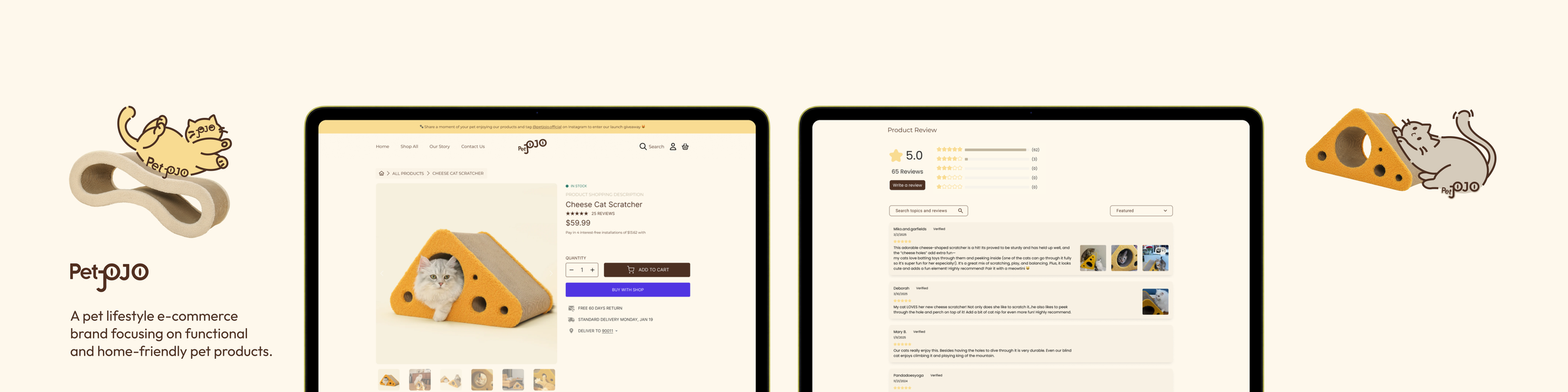
This UX case study focuses on redesigning the PetJoJo website (Website 2.0) and creating new icons and animations.
The redesign significantly improved the shopping experience by reducing user confusion, streamlining the add-to-cart flow, and increasing trust through a more transparent review section, helping users make faster and more confident purchase decisions.
The Problem
Due to time constraints, the first version of the PetJoJo website was built as an MVP, prioritizing speed and efficiency over user experience. It failed to effectively drive users to purchase directly through the website, and even when users visited the site, the purchase conversion rate remained low.
Because Amazon offers a more convenient and familiar shopping experience, around 80% of the customers chose to purchase through the Amazon storefront instead of PetJoJo’s website.

How might we keep users engaged and confident throughout the shopping experience so they choose to purchase directly from PetJoJo instead of Amazon?
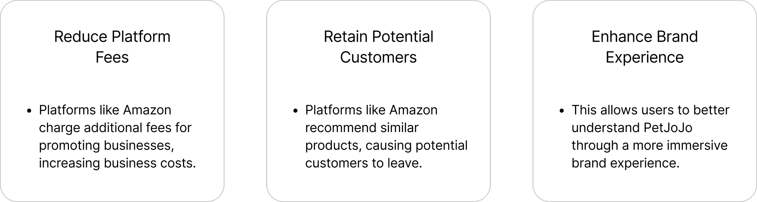
Stakeholder Goals
- Context -
Current Website
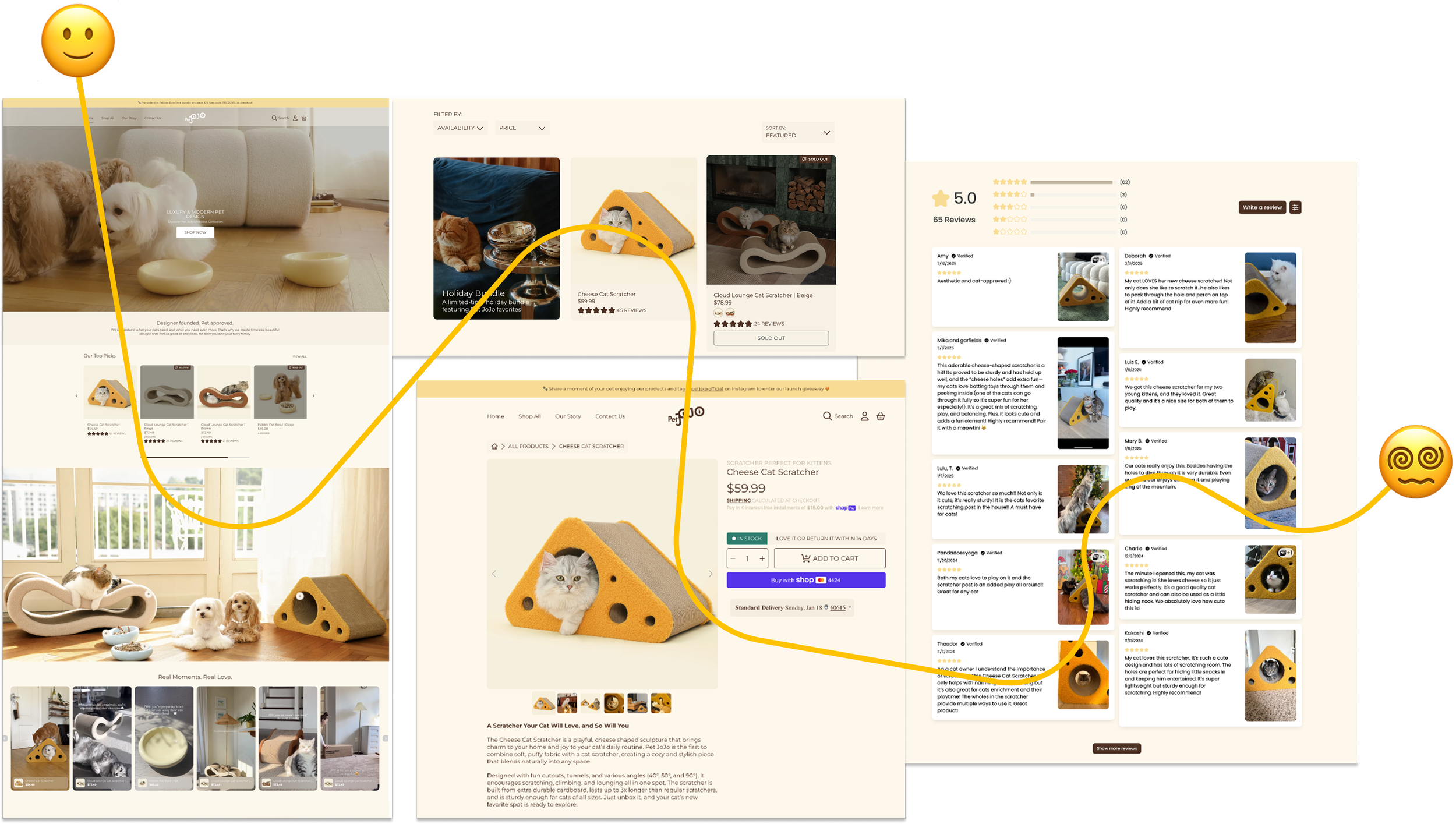
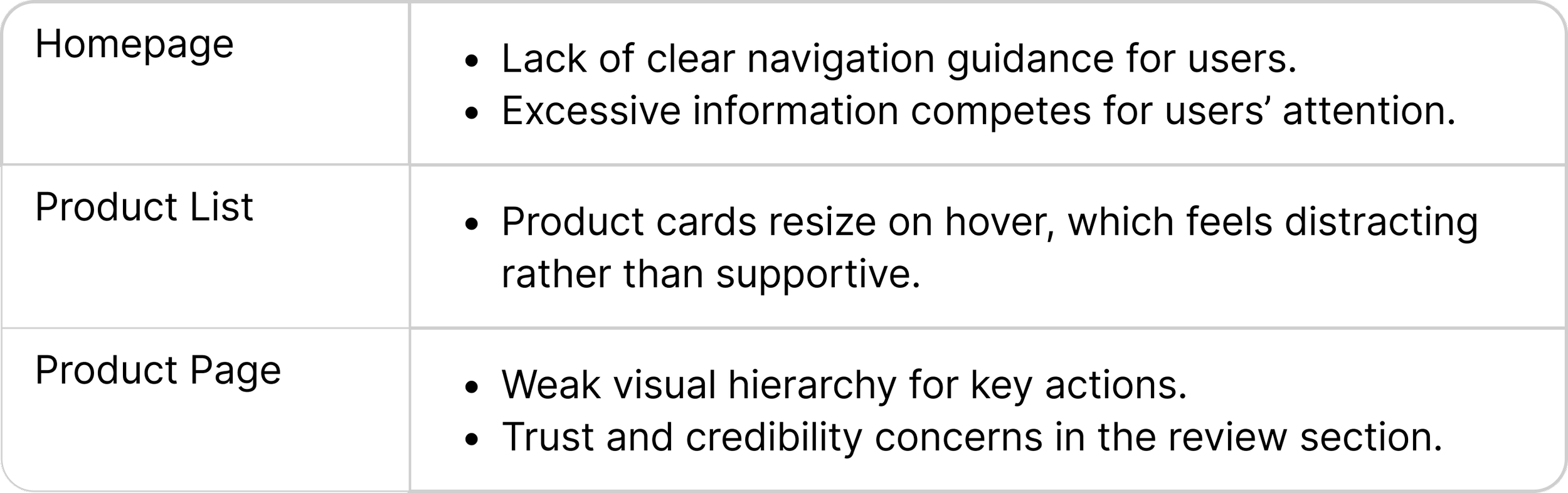
Users enjoyed the playful branding and detailed homepage experience, but the navigation from the homepage to product pages lacked clarity. As users moved toward key purchase actions, the experience became overwhelming and could lead to drop-off before purchase.
Key Challenges
- Research -
Which website page has the greatest impact on conversion, trust, and the shopping experience?
We started by identifying which website page should be prioritized for redesign, while understanding what drives or prevents direct purchases. As UX designers, our goal was to determine the highest-impact opportunity for both user experience and business performance.
Hypothesis:
The product page has the strongest influence on purchase decisions. If it fails to clearly communicate product value and build trust, users are more likely to leave the site and purchase through platforms like Amazon.
User Persona - Jobs to Be Done
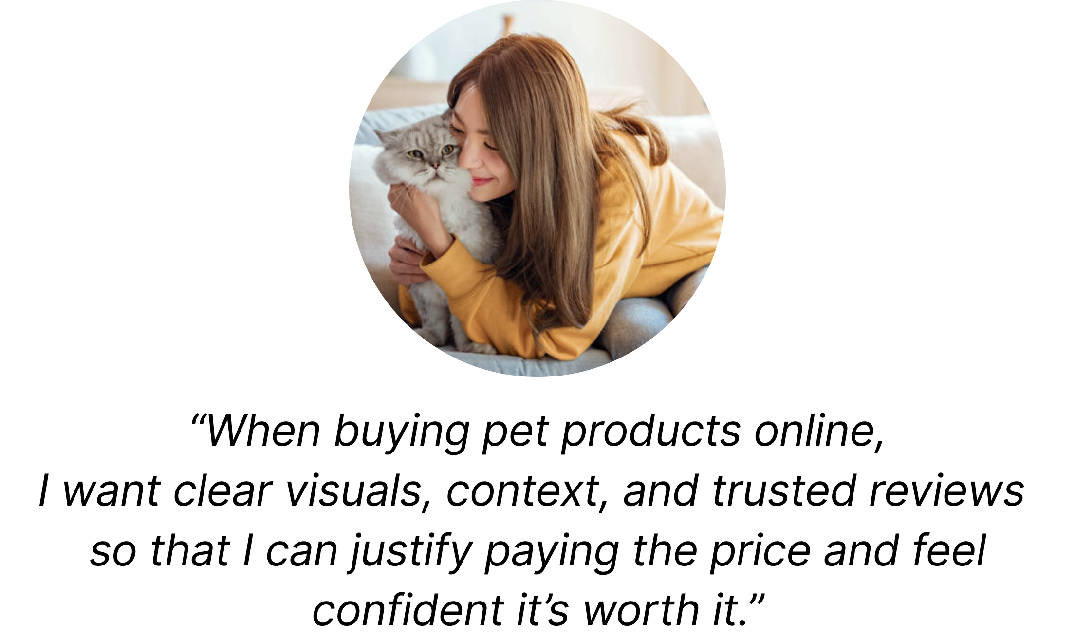
See the product in real home environments
View it from multiple angles and in close-up detail
Quickly understand its quality, materials, and durability
Assess value within a small, curated set of options
Check reviews to validate decisions and real-world usage
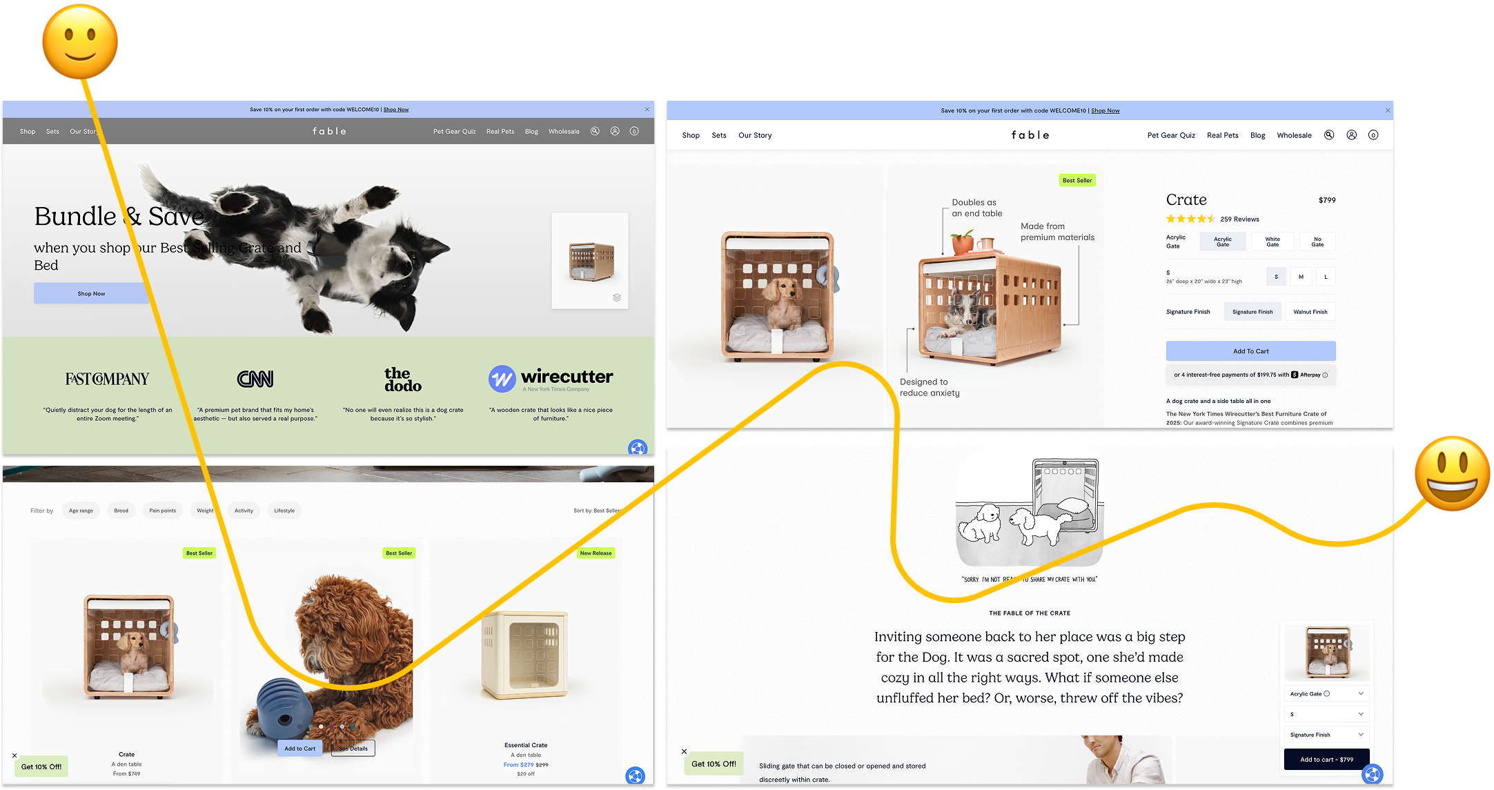
Compared to PetJoJo, Fable Pets’ strengths include:
clearer browsing structure
stronger content hierarchy
guided user attention
easier product understanding
more trustworthy presentation
Competitive Analysis - Fable Pets
User Interview
Here are some key quotes and concerns from the participants:
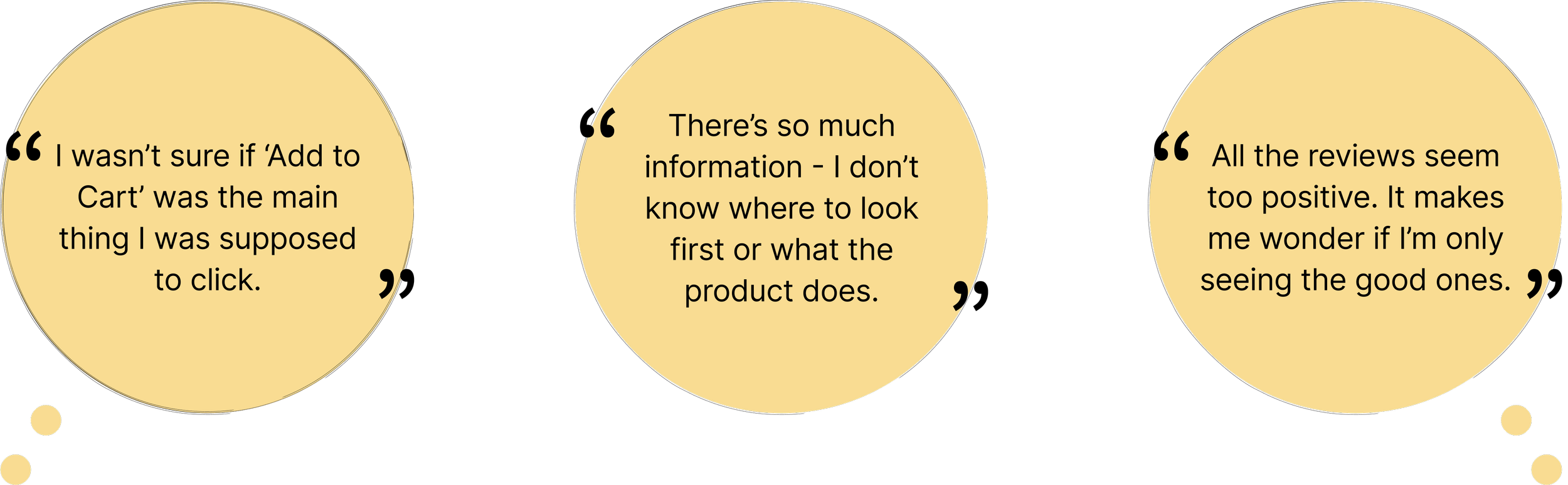
These concerns aligned with the original hypothesis: users were not lacking interest in the product itself - they were struggling to trust and understand the product page experience. User personas and competitive analysis further confirmed that the product page was the highest-impact opportunity for redesign.
Key Insights
→ Unclear Call-to-Action hierarchy caused hesitation during purchase decisions.
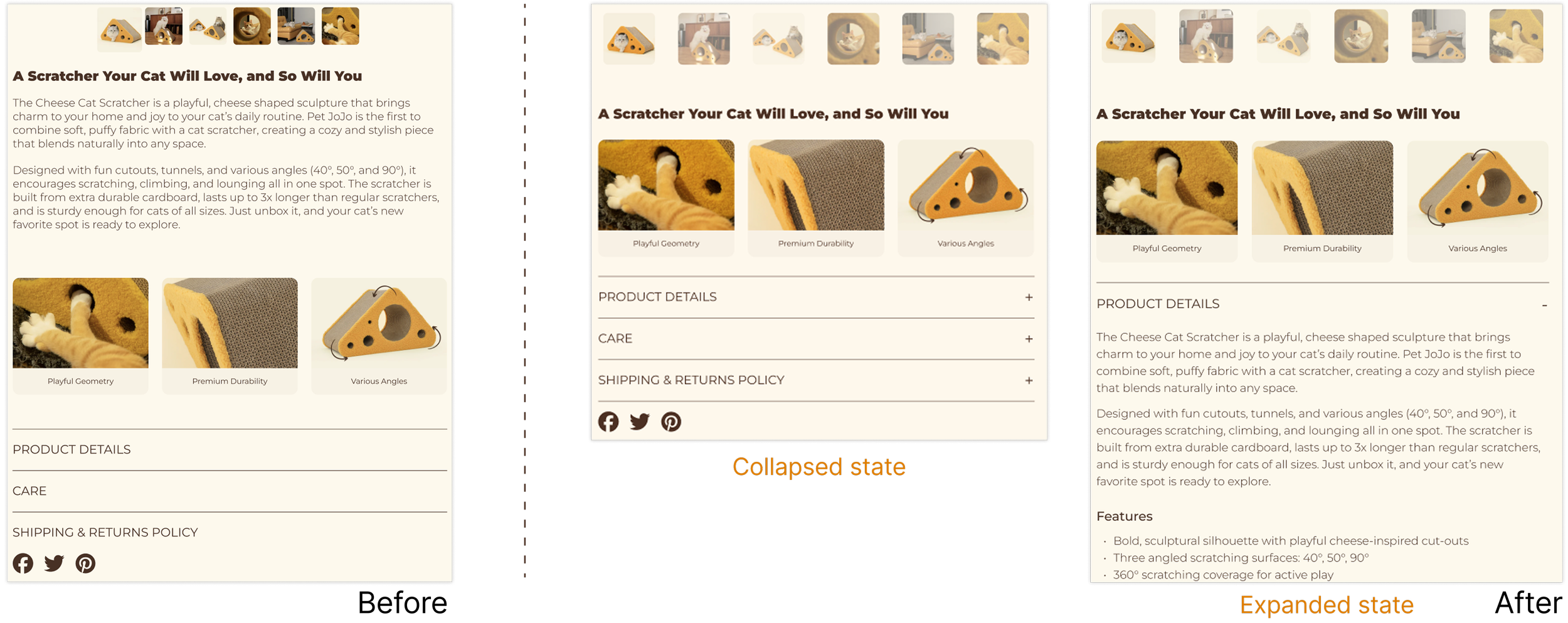
→ Dense product information made it difficult for users to quickly understand product value.
→ Overly positive reviews reduced trust and purchase confidence.
- Design -
During the design iterations, we implemented key design updates focused on the Add-to-Cart experience, content display, and review section.
Key change #1: Strengthened Add-to-Cart visibility
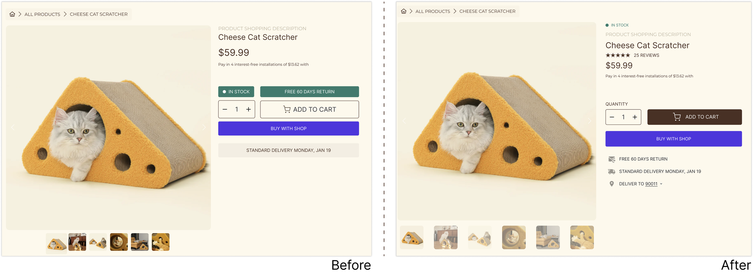
Key change #2: Enabled seamless Add-to-Cart access while scrolling
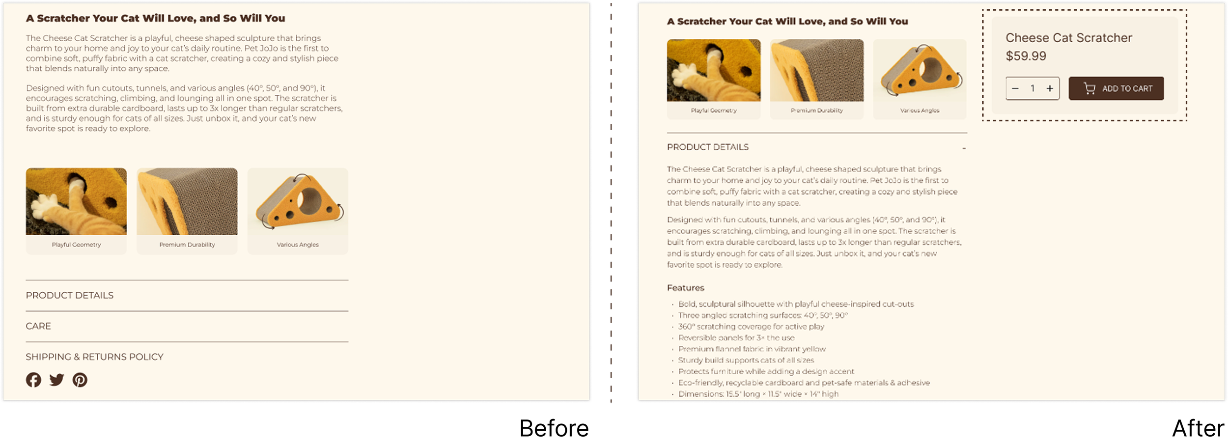
Key change #3: Reduced cognitive load when viewing product details
We went through a lot of debate with stakeholders and gained a more comprehensive understanding of the product.
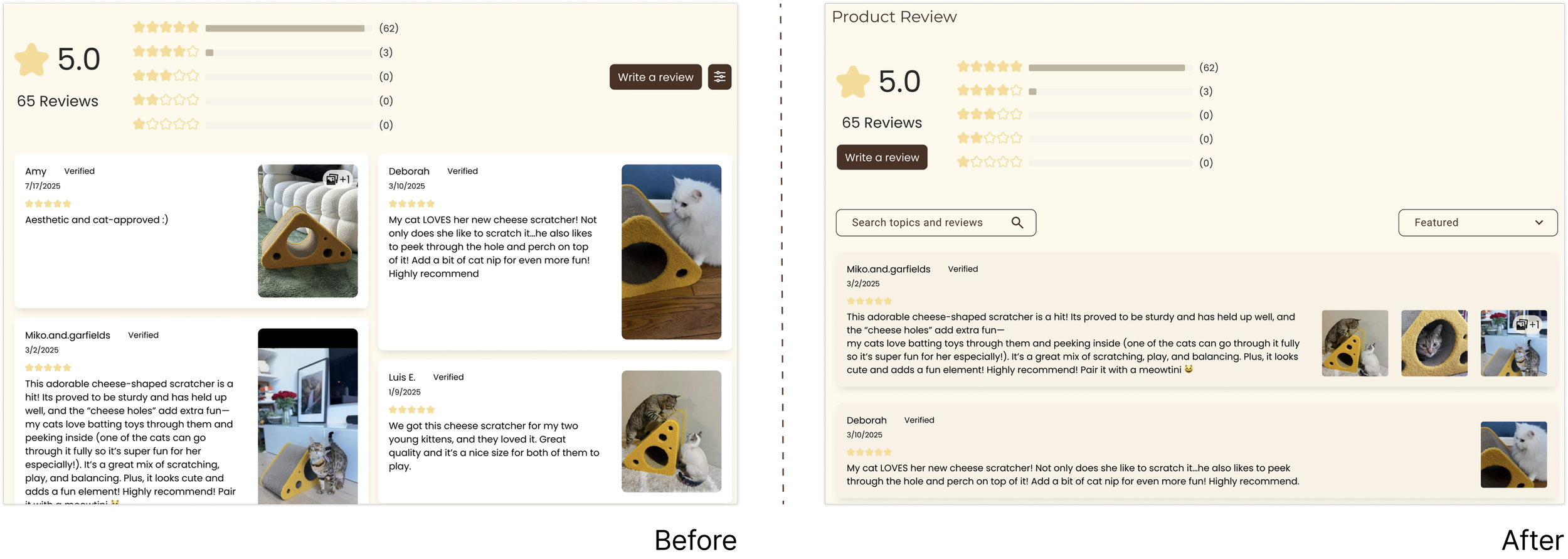
Key change #4: Increased trust and review discoverability
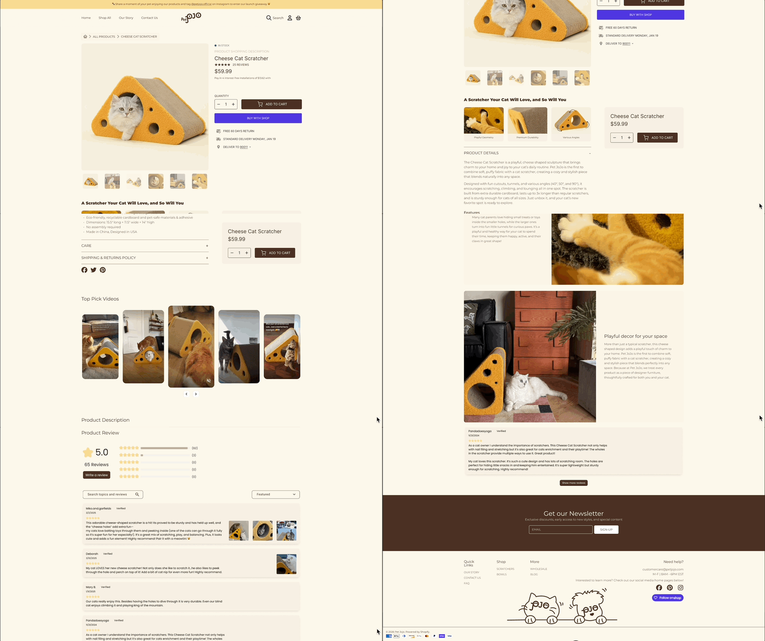
Final Design Outcome
- Branding -
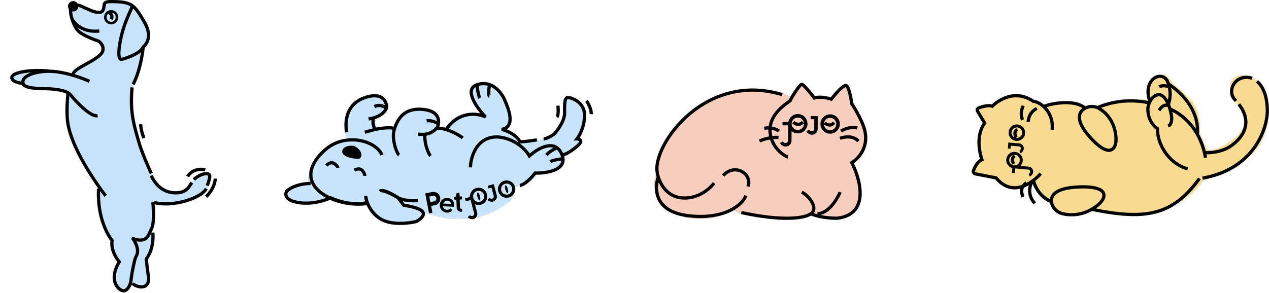
Illustrations
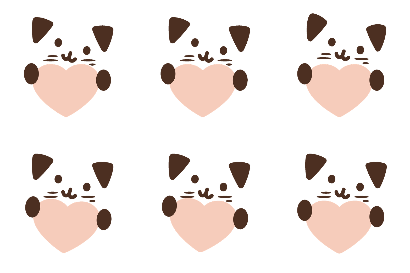
We explored new elements - such as the movement of dogs and cats - based on future product categories in the next launch.
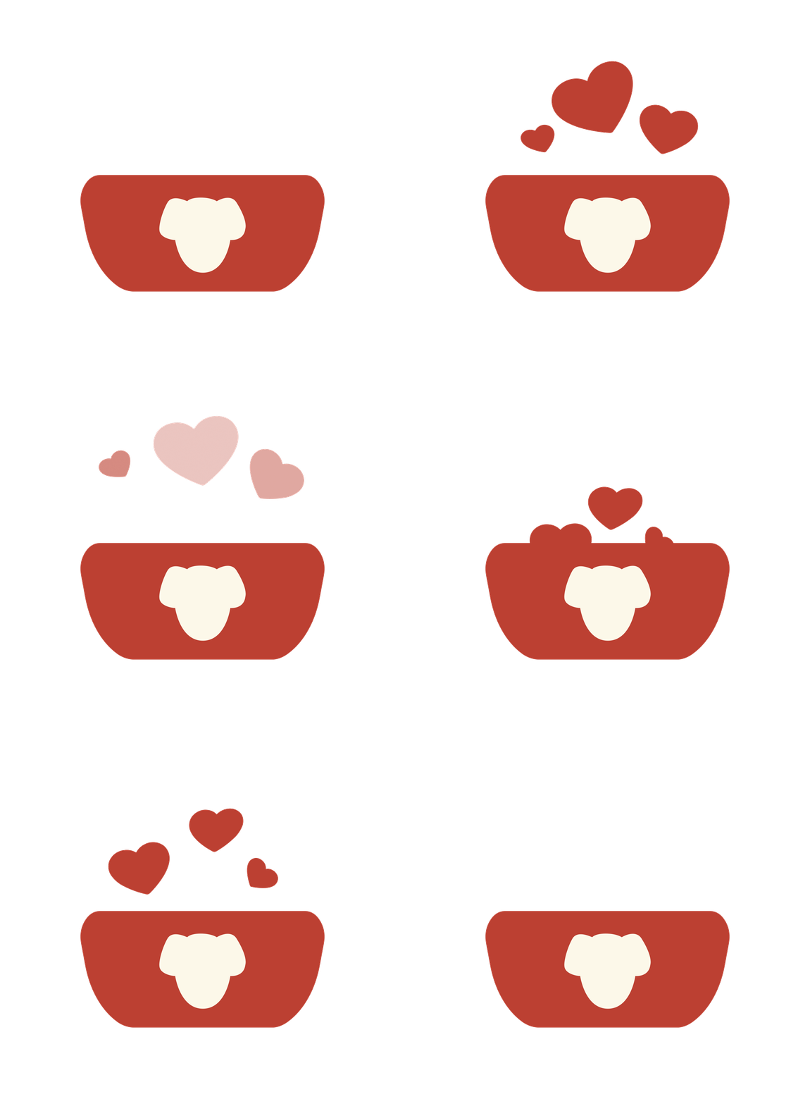
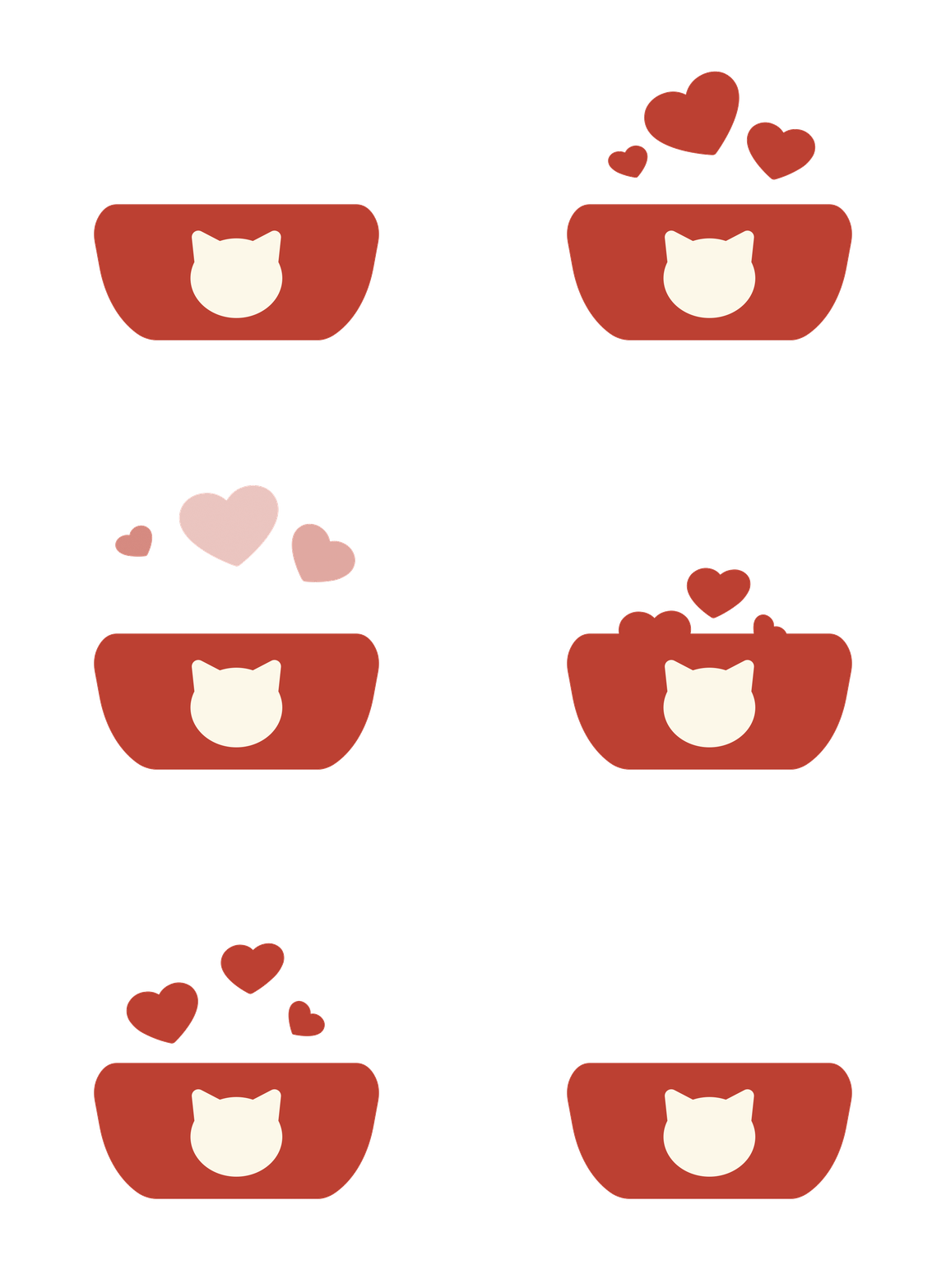
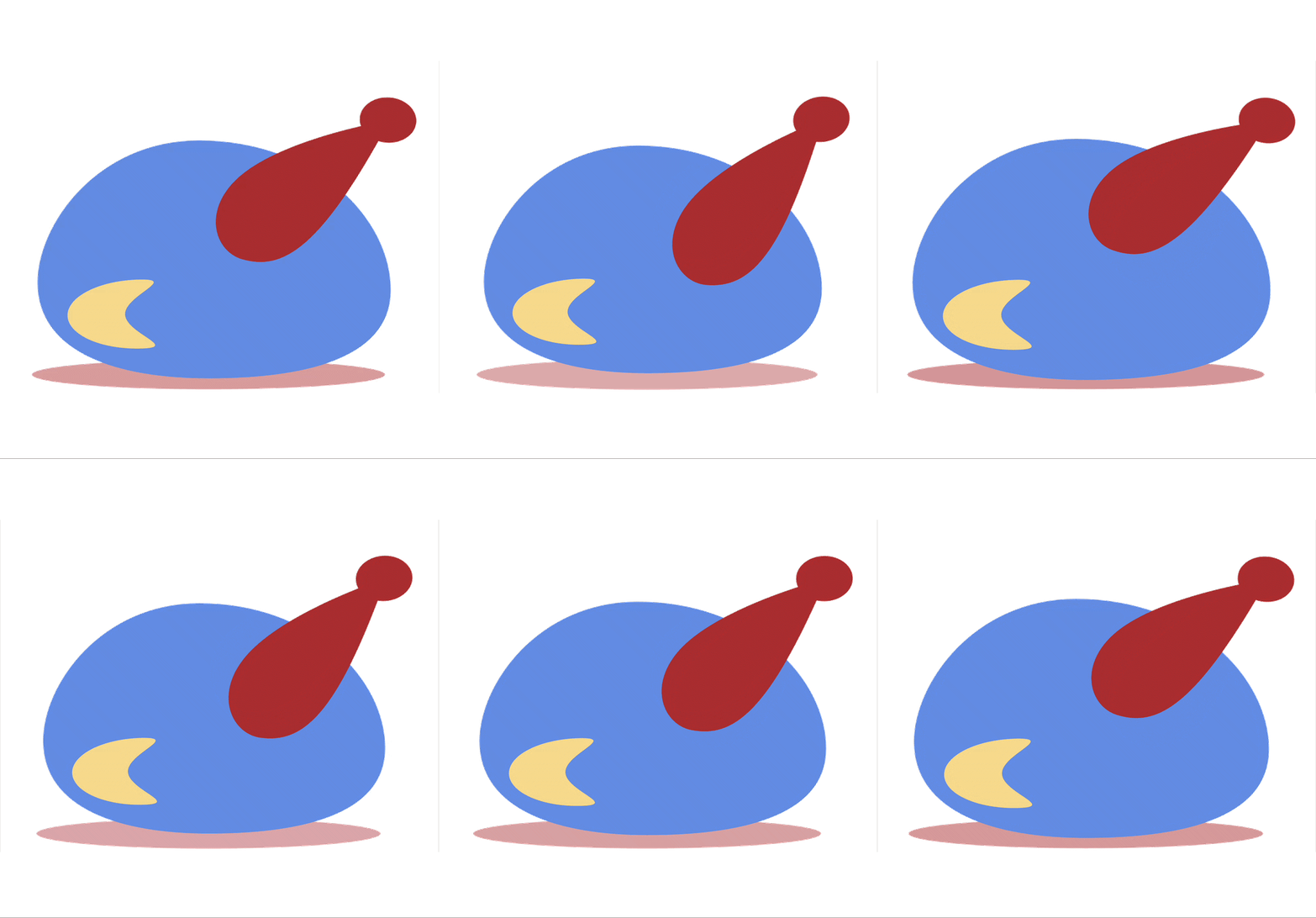
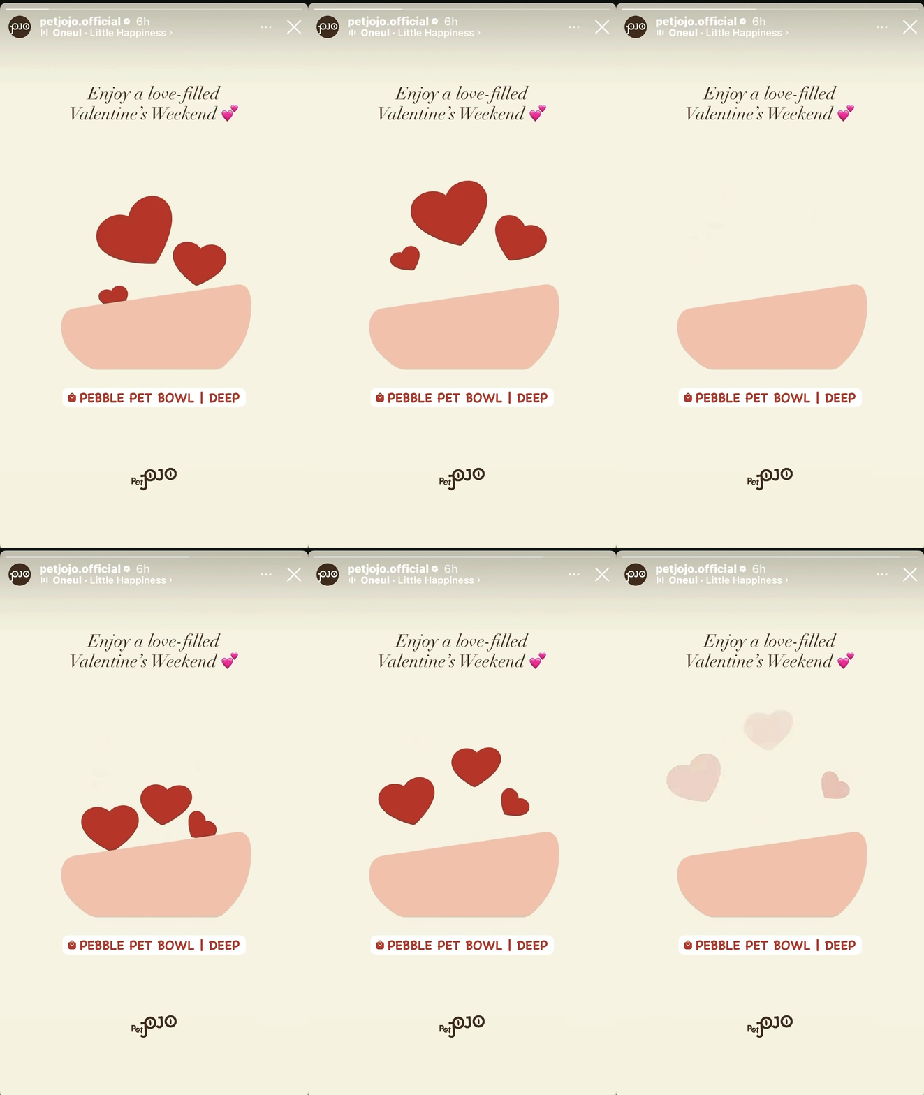
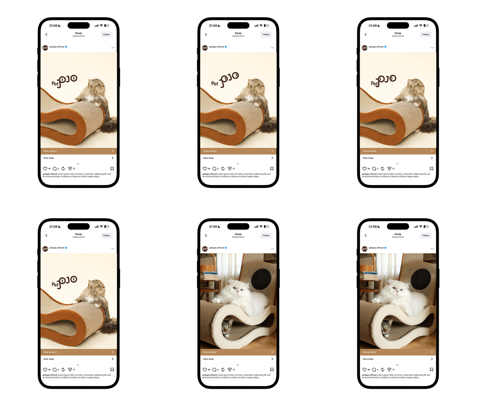
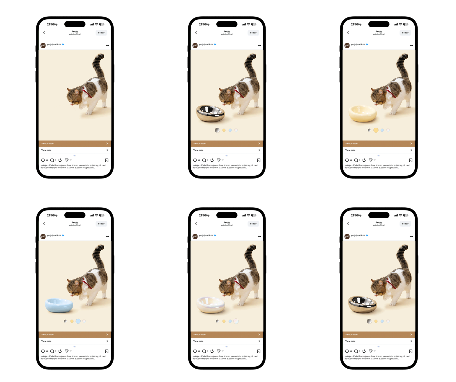
Icon Animations & Used on Social Media
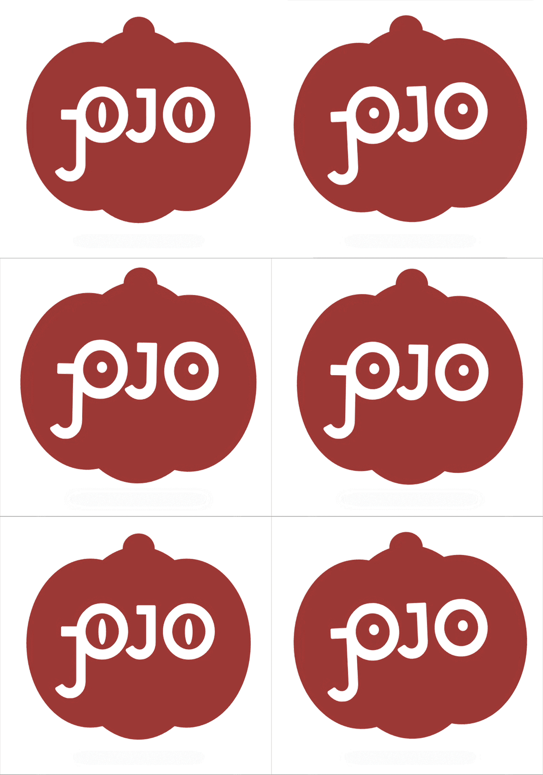
We focus on seasonal promotion - created Valentine’s Day and Thanksgiving icons.
The one on the right is to promote PetJoJo’s new product, the Pebble Pet Bowl.



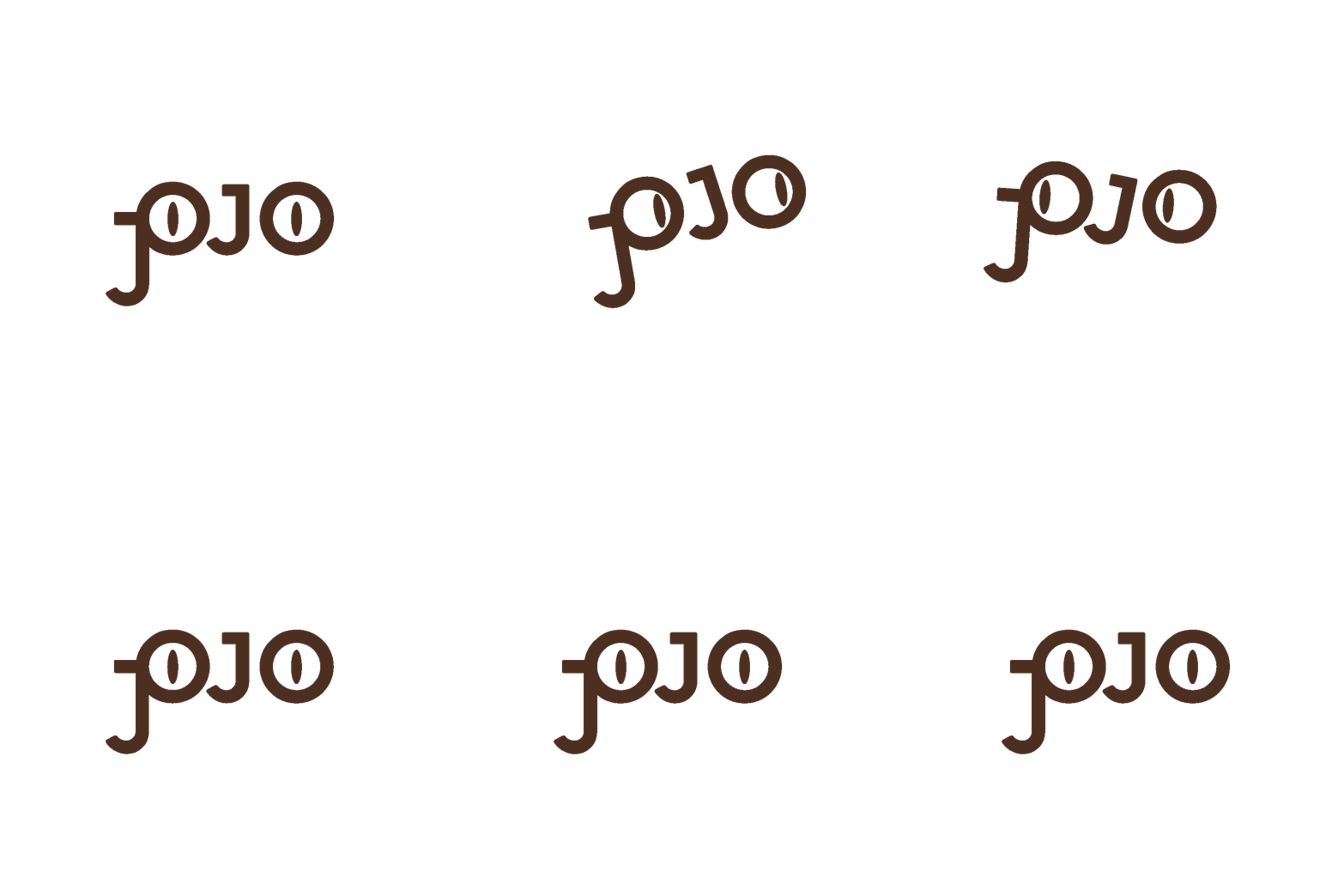
Logo Animation: Smile - Blink - Move


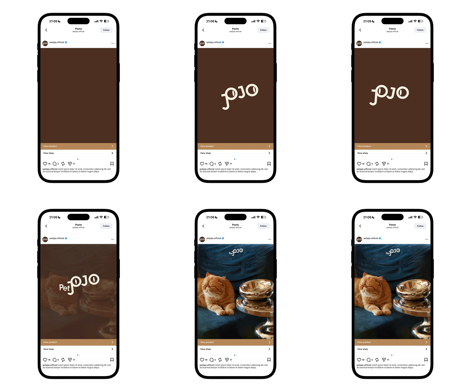
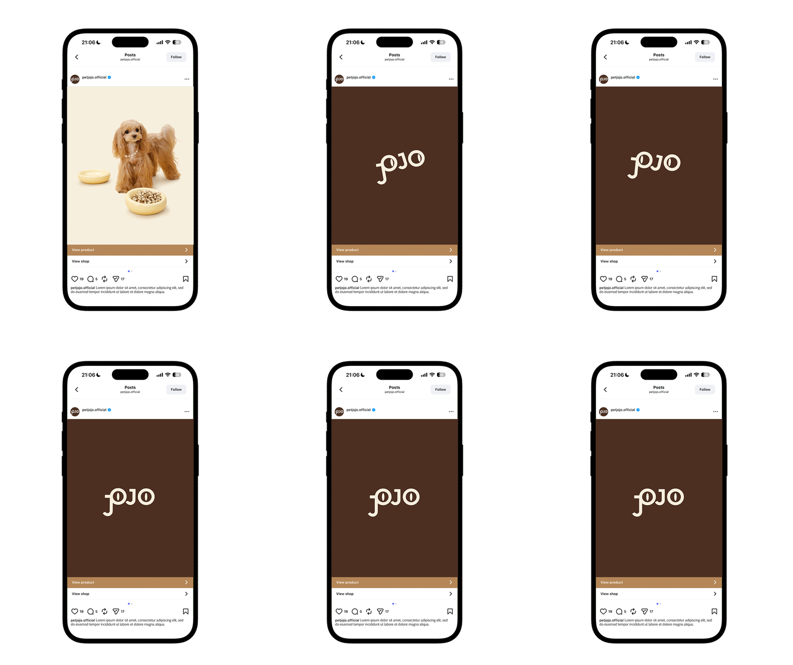
Intro - Outro - Transition - Exploration
- Reflection -
Design Impacts & Early Results
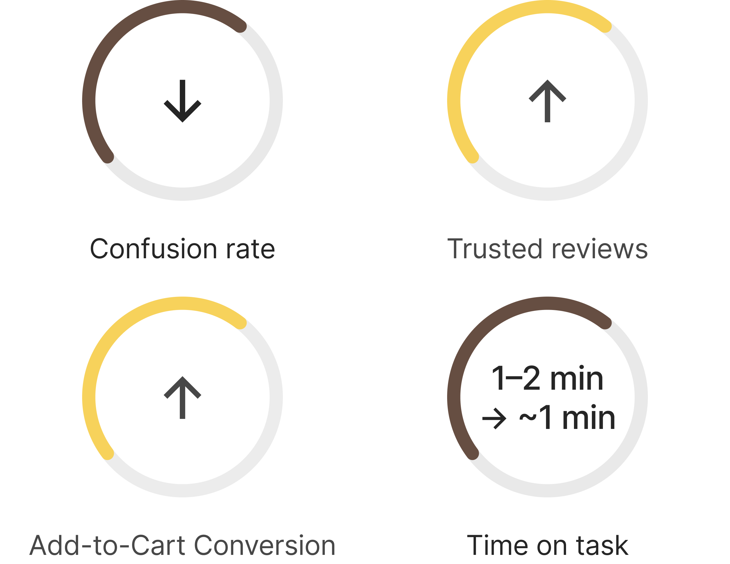
Users found the product page smoother to navigate with reduced confusion, supported by clearer visual hierarchy in the Add-to-Cart design.
With the review section presented in a single column and a keyword search feature, users were able to quickly find relevant information.
The redesigned experience increased the “Add to Cart” click rate, indicating stronger purchase intent.
We tracked that in the previous version, users typically spent 1–2 minutes understanding the product before adding it to their cart. In the redesigned version, users completed the same task in around 1 minute.
✅ The results indicate that the redesign more effectively meets user needs.
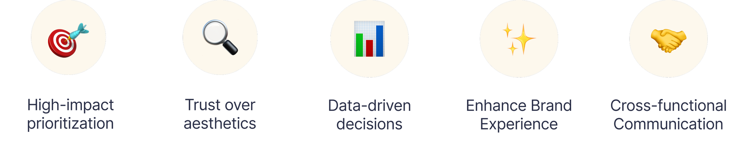
What I Learned
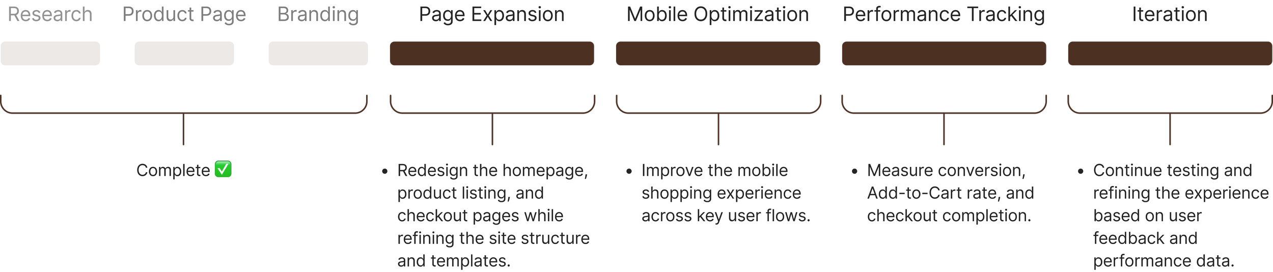
Next Steps
If you’d like to see more or would like to get in touch, do email me at szeng323@gmail.com
Thank you for reading!
More Projects: